Waldorf News
Color in the Waldorf School: Van James

In old Hawai’i, when a rainbow appeared in the sky, the people declared that a divine presence was near and that it was a sign of “heavenly footsteps” coming to light on the earth. Many cultures, including the Judeo-Christian tradition, see the naturally occurring spectrum of colors as a “token of the covenant between God and man,” between the spiritual and the physical. Clearly, color is a bridge between our inner soul life and the outer physical world, for we say we are “feeling blue,” “seeing red,” behaving cowardly or “yellow,” being “green with envy,” “in a black mood,” or “in the pink.” Rudolf Steiner, the founder of Waldorf education, said: “Color is the soul of nature … and when we experience color we participate in this soul.”
Color is the emotional life of the natural world and if we can get beyond just looking at it as though it were mere gradations of gray and truly experience the wonderful visual sensations all around us that we call color we would then be intimately engaged with this living being, long referred to as Mother Nature, and more recently as Gaia—the living planet.
If we look into a Waldorf school classroom we see the deliberate and consciously considered use of color. Although not every Waldorf school is exactly the same in its choice of colors there is often a general consistency based on a response to the stages of child development.
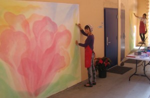
For instance, in the nursery, kindergarten, and early grades, a soft, warm, pink tone is usually selected for walls and curtains because of its gently active and supportive quality. Pink is a loving, innocent color, decidedly feminine in character. Therefore, it is a natural color choice for the daily embracing of this age group.
The Waldorf classroom colors evolve from these warm, reddish tones in the early grades, through energetic orange/yellow around third grade, into the middle spectrum greens around fourth and fifth grade. It is here at the half-way-point of childhood that a kind of balance is achieved just before the onset of puberty. Green is the balanced color between light and darkness, and meets this age group in a harmonious way. From sixth grade on into the high school, various shades of blue dominate, and even lavender, lilac, and violet tones are indicated for the more inwardly active, thoughtful work of the upper school adolescent. However, craft rooms are often appropriately painted with warm colors, and spaces for eating are aided by appetite sympathetic golden-orange colors.
The interior colors in a Waldorf school are meant to support the child’s general phase of development at the same time as to enhance the educational experience for the particular grade level. Each classroom is a unique space for a specific age group and its activities. Therefore, each classroom wears a color appropriate to that space, the age of the students, and what generally takes place in it. Now if you look around at most state and other independent schools there is often a one-color-fits-all scheme, generally in shades of institutional green. This is simply not the case in a Waldorf school.
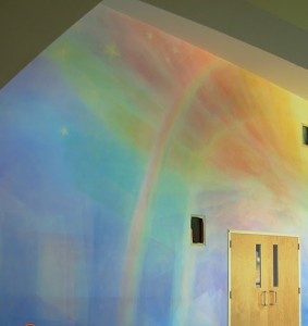
Another important aspect to the color environment in a Waldorf school is the transparency of color. The color treatment, called lazure, is not a standard, industrial flat paint but a medium that involves several watercolor-like applications veiled over each other to create rather subtle hue variations as well as a translucent effect. The reason for this is that with a lazured room, one does not experience the boundary of the wall as abruptly as with the flat painted surface. It is as though one can “breathe” beyond the surface of the wall and not feel as contained or bound by the room’s walls.
Waldorf schools, hospitals and clinics, retirement homes and therapeutic communities, restaurants and shops, as well as private residences have used this lazure technique for its beneficial quality of making one feel less trapped indoors and giving one “soul space.”
External building colors can vary greatly from school to school and from geographic setting and cultural environment. Building colors also change with fashion or with what commercial paint manufacturers are selectively promoting at any given time.
But over and above this the colors for the new Honolulu Waldorf High School were selected with the following considerations in mind: a building for adolescents to learn and live in, the surrounding natural environment, and a unique aesthetic contribution to the local community.
The Makai campus site in ‘Aina Haina has been renovated and upgraded to serve as the new home for the Honolulu Waldorf School’s upper classes. Its exterior is painted in a peach color with accents in a contrasting ultramarine blue. Peach is a warm, nurturing, heart-felt color, inviting and accepting. It is a similar hue to that of the lower school buildings in Niu Valley and is a healthy, natural tone. In nature one sees nuances of this color in flower blossoms, sandy beaches, sunrises and sunsets. It is similar to the color that every newborn child reveals on the palms of their hands and the soles of their feet, no matter what their race.
The dark blue trim is almost an exact complementary color to the lighter peach tone. It is a cool, reserved tone that expresses thoughtfulness, deliberation, introspection, and even devotion. It is a color that harkens to the sea and the sky. Although these two colors are strong in contrast, striking and bold, their combination is warm and welcoming, yet alert and wakeful. These are colors we trust will serve the high school students so they can meet their community and protect their environment with strength of heart, intelligence, and courage for the future.
This article originally appeared in the Honolulu Waldorf School’s Newsnotes in October ’09 which you can view here.
 Jamie York Books, Resources, Workshops
 Bringing Love to Learning for a Lifetime
 The Journey is Everything
 Caring for All Stages of Life
 Waldorf-inspired Homeschool Curriculum
 Transforming Voices Worldwide
 Waldorf EC Training & Intensives in Canada
 Flexible preparation for your new grade
 Immersive Academics and Arts
 Roadmap to Literacy Books & Courses
 Discovering the Wisdom of Childhood
 Space speaks. Its language is movement.
 Grade Level Training in Southern California
 Full-Time Teacher Education
 Association for a Healing Education
 Art of Teaching Summer Courses 2025
 The Art of Administration and Leadership
 Everything a Teacher Needs
 Middle School Science With Roberto Trostli
 Quality Education in the Heartland
 ~ Ensoul Your World With Color ~
 Storytelling Skills for Teachers
 Summer Programs - Culminating Class Trips
 Dancing for All Ages
 Apply Today: New Cohort Starts Nov. 2025
 Bay Area Teacher Training
 Train to Teach in Seattle

 RSS Feeds